


SHOWCASE
Every project tells a different story. Over the years, I've had the pleasure of working with businesses, community groups, charities and tourism organisations on a wide variety of creative projects, from branding and graphic design to illustration, mapping and web design. This showcase highlights a selection of recent work, including the popular Walk Alyth Maps, promotional materials and digital content for Strathmore Open Studios, branding and marketing for Nature Minds and my design work for Play Academy Scotland. Together, these examples demonstrate the broad range of creative services available through Strathmore Design and the bespoke approach I bring to every project.

Alyth Walk Maps
ILLUSTRATION - DESIGN - PRINT - COMMUNITY GROUP
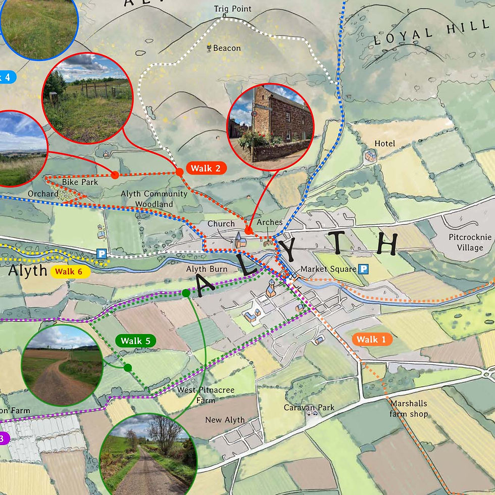
Having an Illustrated walking map was something the local path network team was looking for, to help locals and tourists alike. The aim was to get people out, exploring the miles of walking trails in the area. To make it easy to navigate for walkers, every local feature was included, from trees and fields to roads, paths and unique geographical features. The hand drawn illustrative style helped to ease the user into the map without it all getting too busy.
Illustration
The base illustration for the walking trails was created digitally using reference photography, the client's route maps, and an agreed visual style guide, which in this case featured a hand-painted watercolour aesthetic. The process began with carefully drawing the route outlines before applying layered colour washes beneath. Accuracy was essential throughout, with every hedgerow, tree, building, and landscape feature meticulously illustrated to ensure the map remained both visually engaging and a reliable navigation tool for users.

Information Design
On the reverse of the Walk Alyth maps, the client requested detailed route information, photographs of key points along each walk, and other useful content for users. Each route was colour-coded and clearly described from start to finish, with visual markers incorporated throughout to help walkers stay on the correct path. The final design featured five walking routes, each accompanied by a comprehensive route description and supporting imagery. The last feature highlighted in the map is a zoomed up section within the town center, focusing on street names and town features.

Printing
The final walking map was produced as a double-sided A2 sheet, incorporating a Z-fold and an additional half-fold to create a compact A5 format. This pocket-sized design was specifically chosen to fit comfortably within a modern walking jacket, making it practical for use on the trail. All photography featured throughout the publication, including the cover image, was captured and produced in-house, ensuring a consistent visual style across the finished map.

Expanding the world, one map at a time
The success of the original walking map was evident, with demand quickly exhausting its third print run. Building on this popularity, the client commissioned a second map featuring routes further afield, with the goal of linking neighbouring communities into the wider local walking network.
Following the publication of the second map, a third map was commissioned for the neighbouring town of Blairgowrie. Designed to complement the Alyth walking map series, it expanded the network of accessible routes and reinforced connections between local communities and the surrounding countryside.
The fourth in the series will be published soon, taking the routes further afield and into the neighbouring towns of Meigle and Ardler.


Strathmore Open Studios
DESIGN - PRINT - PROMOTION - WEBSITE - SOCIAL MEDIA - COMMUNITY GROUP
Strathmore Open Studios, an annual art-based event spanning the picturesque Strathmore valley, sought a unified brand that seamlessly complemented their existing logo. My task encompassed a comprehensive suite of deliverables: brochures, posters, flyers, signage, social media setup, and a bespoke webpage with its own domain address. As this event recurs yearly, I update visuals to harmonise with the established branding to bring a fresh seasonal look to the established branding, while also innovating to make the event more successful each successive year.
Event Brochure and Theme
The Open Studios brochure is at the heart of the event, serving as both an artist catalogue and a practical guide for visitors. Showcasing over 50 artists, it features a detailed map across the central pages, making it easy for the public to locate participating studios and plan their visits.
The primary objective of the brochure is to introduce visitors to the artists and provide clear, accessible information to help them navigate between studios with ease. Each artist is represented by a prominent image of their work, while a carefully considered colour-coding system distinguishes the various artistic disciplines. Multiple navigation options are provided, including contact details, studio addresses, What3Words locations and, more recently, QR codes linking directly to Google Maps, simplifying route planning to the scan of a code.
Thoughtful adjustments to spacing and layout have also allowed four artists to be featured per page without compromising essential information. This improvement has helped reduce both printing and paper costs for participating members while maintaining the brochure's clarity and usability.
In keeping with previous editions, the established visual identity was retained, ensuring continuity and reinforcing recognition of the Open Studios brand among returning and new visitors alike.

Promotion & Social Media
The success of the Open Studios event relies on effective promotion and public engagement. Each year, a combination of traditional marketing methods, including flyer distribution, event brochures and poster campaigns, is used to raise awareness across the region. In recent years, digital promotion has become an increasingly important part of the strategy, with a dedicated Facebook event page helping to reach a wider audience.
To maximise engagement online, a range of promotional assets were created, including branded graphics, artist spotlights and promotional videos. These materials were shared with participating artists, enabling them to promote the event through their own networks and further extend its visibility and reach.

Webpage
Recognising that not every visitor will have access to a printed brochure, a dedicated website is produced each year to support the event and help guide visitors throughout the local area. The website provides a convenient and user-friendly alternative, with direct links to Google Maps enabling seamless navigation to individual artist studios.
In addition to practical visitor information, each participating artist is given a dedicated page, allowing them to showcase a broader selection of their work than is possible within the limited space of the printed brochure. This creates a richer experience for visitors and provides artists with an enhanced platform to present their practice.
As with many of the websites I design, the Strathmore Open Studios website is built with long-term usability in mind. Event organisers are able to update content, add new artists and make adjustments themselves, ensuring the site can be easily maintained and developed from year to year.

Design Innovation and growth
While some may be reluctant to alter a successful formula, I believe there is always room for improvement. With Strathmore Open Studios, each year presents an opportunity to refine and enhance the visitor experience. Whether through higher-quality photography, improved navigation tools such as QR codes, or more efficient and cost-effective print production, the aim is always to build on previous successes.
The event map is regularly reviewed and updated to ensure it remains as clear and intuitive as possible, allowing visitors to quickly identify artist locations and disciplines across the region. The brochure's purpose is to make exploring the event straightforward and enjoyable, not confusing or frustrating.
As part of this ongoing process, I continually assess similar events and competing publications, seeking new ideas and best practices while ensuring Strathmore Open Studios remains a benchmark for others to follow. Maintaining a strong, recognisable brand while continually improving functionality has been central to the event's continued success.


Nature Minds
LOGO - WEBSITE - SOCIAL - PROMOTION - BOOKLET - BUSINESS
Nature Minds is a mindfulness and self-growth workshops for children, teenagers and adults, focused on nurturing wellbeing and fostering a deeper connection with nature. Through a blend of reflective practices and engaging activities, participants are encouraged to develop greater self-awareness, resilience and confidence while exploring the relationship between personal wellbeing and the natural world.
Workshops incorporate a range of approaches, including mindfulness practices such as meditation, mindful movement and relaxation techniques. Participants are also introduced to creative mnemonic methods designed to strengthen memory and learning, alongside accessible insights into neuroscience that help explain how the mind and brain work. Role-play scenarios, journaling and guided reflection provide further opportunities for personal growth, helping individuals build practical skills they can apply in everyday life.
The client wanted a whole branding sweep, from a logo to the website and promotional assets. The final job was to produce a full booklet taking readers through the program on their own walks.
Logo Development
Sometimes, the logo design starts well before the client has even settled with a name for their brand. In this case, as with others, I start with a basic sketch with as many options as I can produce in a given time. Having a wide range of options takes the process in new and unexpected directions. The available suggestions, crossed referenced with each other, gives the process a unique journey to every client, giving them a final logo that speaks to them and a logo that's unique.
With nature Minds, a botanic symbol was suggested with natural colours and hidden imagery in the design to suggest the love of nature and a mindful experience.
The choice of typography, colour and the use of space is also very much within a clean, fresh and minimalist aesthetic with the final job of producing varying versions of the logo for different print or screen based situations.

Website
The Nature Minds website was designed to reflect the calm, restorative principles of forest bathing, mindfulness and connection with nature. A clean, uncluttered layout was developed to create a sense of tranquillity from the moment a visitor arrives on the site. The homepage features a full-width video banner showcasing a peaceful woodland environment, immediately establishing the atmosphere and ethos of the organisation while encouraging visitors to explore further.
The primary focus of the website is the promotion of upcoming forest bathing sessions, mindfulness workshops and nature-based activities. Clear navigation and thoughtfully structured content allow visitors to easily learn about the benefits of each activity, view event information and discover past workshops. Care was taken to ensure that the site remained accessible and easy to use across desktop, tablet and mobile devices.
The visual branding of the website was closely linked to the identity established during the logo design process. Natural greens, earthy tones and organic design elements were carried throughout the site to reinforce the connection with the outdoors, creating a consistent brand experience across both printed and digital media. The result is a welcoming and informative website that reflects the values of Nature Minds while providing an effective platform for promoting its services and events.

Event Marketing
The event marketing materials created for Nature Minds were designed to promote forest bathing sessions and workshops across both print and digital platforms. The visual identity drew inspiration from the natural environment, using an organic colour palette, calming imagery and clear typography to communicate the restorative and mindful experience at the heart of the business. Each design was carefully tailored to reflect the values of wellbeing, nature connection and personal growth, helping to establish a recognisable and engaging brand presence.
A coordinated series of flyers and social media graphics was produced to advertise upcoming workshops, guided forest bathing sessions and seasonal events. Consistent branding across all materials ensured a professional and cohesive appearance, while thoughtfully designed layouts and imagery captured attention and encouraged participation. The combination of print and social media marketing enabled Nature Minds to reach a wider audience, effectively promoting its services while reinforcing a strong and memorable visual identity.

Forest Bathing Booklet
This booklet was thoughtfully designed and illustrated as a mindful companion to the Nature Minds forest bathing experience, with visuals carefully crafted to complement the organisation's logo, website and calming ethos. Published as a practical pocket guide, it invites readers to slow down, immerse themselves in nature and experience the restorative benefits of forest bathing. Blending serene artwork, engaging content and a cohesive visual identity, the booklet serves as a trusted companion for solo wanderers, families, friends and curious young explorers alike. Returning throughout the changing seasons, visitors are encouraged to deepen their connection with the natural world, noticing more, listening more closely and finding a genuine sense of belonging among the trees. More than simply a guide, it is an invitation to remain attuned to the rhythms of the Earth, with the Den of Alyth always ready to welcome you back to nature.


Play Academy
LOGO - ILLUSTRATION - WEBSITE - PROMOTION - BUSINESS
From a graphic design perspective, the branding for Play Academy was developed to reflect the organisation's inclusive, welcoming and child-focused ethos.
The project encompassed the creation of a distinctive logo, a professional website and a suite of promotional materials, all designed to communicate the academy's commitment to providing enriching play experiences for children of all abilities aged 0-12. Using bright, engaging visuals and a friendly identity, the branding helps establish Play Academy as a trusted and approachable service within the local community. Founded in 2025 by two determined mothers who recognised the need for permanent play facilities in Blairgowrie and the surrounding villages, the organisation's journey was shaped by dedication, perseverance and a clear vision. After securing local authority approval and the necessary funding, Play Academy was able to launch a purpose-designed environment that supports learning, development and social interaction through play, with the branding helping to promote and reinforce its values across both digital and printed media.
Logo Development
The initial logo concepts for Play Academy Scotland were inspired by the chemical structures of serotonin and dopamine, two neurotransmitters closely associated with positive mood, motivation and reward.
Using these molecular forms as a creative starting point, the logo was developed to symbolise the joy, learning and sense of achievement that children experience through play. Bright colours, playful shapes and interconnected elements were combined to create a friendly and engaging identity that reflects the organisation's inclusive ethos. The resulting design balances scientific inspiration with a fun, approachable aesthetic, representing Play Academy's mission to support children's development, wellbeing and confidence in a nurturing environment.

Character Dev
The scientific inspiration behind the serotonin and dopamine molecular structures evolved beyond the logo itself and became the foundation for two unique Play Academy Scotland characters.
Drawing on the interconnected shapes and recognisable patterns found within the chemical formulas, these elements were transformed into friendly, colourful mascots designed to appeal to young children. The playful characters embody the positive feelings associated with learning, discovery and achievement, reflecting the role that serotonin and dopamine play in mood, motivation and reward.
Through illustration and character design, a complex scientific concept was translated into something engaging, approachable and memorable, helping to create a strong visual identity that resonates with children while reinforcing Play Academy's focus on play, development and wellbeing.

Web
Building on the visual identity established through the logo and character development, the Play Academy Scotland website was designed to provide a welcoming and engaging online experience for both children and parents. As the web designer, my goal was to carry the playful energy of the brand throughout the site while ensuring it remained clear, accessible and easy to navigate. The colourful palette, friendly typography and custom illustrated characters, inspired by the serotonin and dopamine concepts, were integrated across the website to create a cohesive and recognisable brand presence.
The website was carefully structured to communicate Play Academy's services, values and activities in an approachable and professional manner. Bright visuals and engaging graphics help capture the attention of young visitors, while clear navigation and well-organised content ensure parents can quickly find information about sessions, facilities and bookings. Responsive design techniques were employed to provide an optimal experience across desktop, tablet and mobile devices, allowing families to access information wherever they are.
By combining thoughtful design, bespoke illustrations and user-focused functionality, the website became an extension of the Play Academy Scotland brand, promoting its mission to support learning, development and wellbeing through play. The result is a vibrant digital platform that reflects the organisation's inclusive ethos while helping to establish trust and engagement within the local community.
